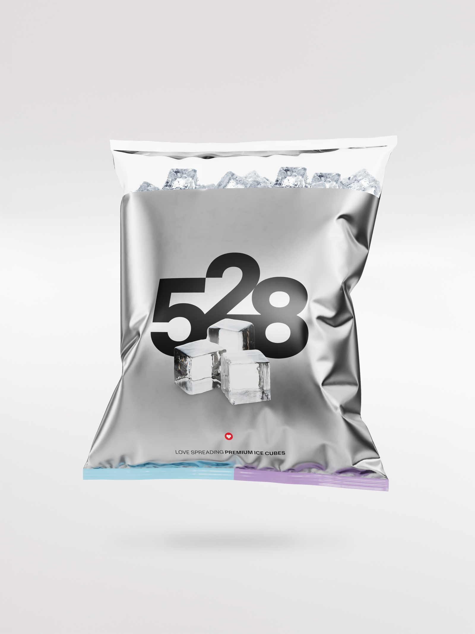
Clarysse
— Luxury that lasts. Designed in Belgium. A bold refresh to match this quality bath, bed, and kitchen linen branding to a no-compromise, high-end status. From outdated
to progressive.


The rebranding gave Clarysse the push it needed to move from an outdated approach to a progressive, premium brand. From subtle details to the overall look, every aspect now conveys sophistication.


Inspired by the softness of the linen — a gentle, plush approach informed the art direction and evoked the sensorial experience of the linens. Soft natural lighting and slow, calm movements created a premium and luxurious feel. The products were showcased in homely vignettes and artful abstractions that emphasised the materials and craftsmanship.


As a high-end brand of bath, bed, and kitchen linen, Clarysse had too little brand equity to convey their premium character. Let's be blunt, a refresh was essential. It was time for a turnaround to a no-compromise status brand with a pared-down style.
During the strategic phase of the proces, we purified the architecture, shifted the positioning to a more premium segment and brought clarity to the service and product overview. The goal? To transform Clarysse into a fully-fledged B2C brand with positioning that reflects its high-quality products.
Visual identity
Our approach for the new logo - which captured the imagination - focused on Clarysse's product range and the letter "C". We embraced the shift in their focus to bed, bath and kitchen and created a strategic triptych that also blended beautifully in terms of visual identity. In addition to the visual brand, we also added a pure and timeless wordmark.
In this brand, we let the products speak for themselves. Outspoken and unabashed. Because they exude what they can deliver: luxury, quality, and a premium experience. A minimalist, neutral and warm colour palette is for that reason a solid match for the brand, without unnecessary frills. The bold 'pop of colour' is added purely through the imagery.
Verbal identity
The softest, the thickest, the most luxurious. For the verbal identity, we knew immediately that we needed to be as straightforward as possible. No fuss, only powerful statements. A confident character that stands out from the competition.
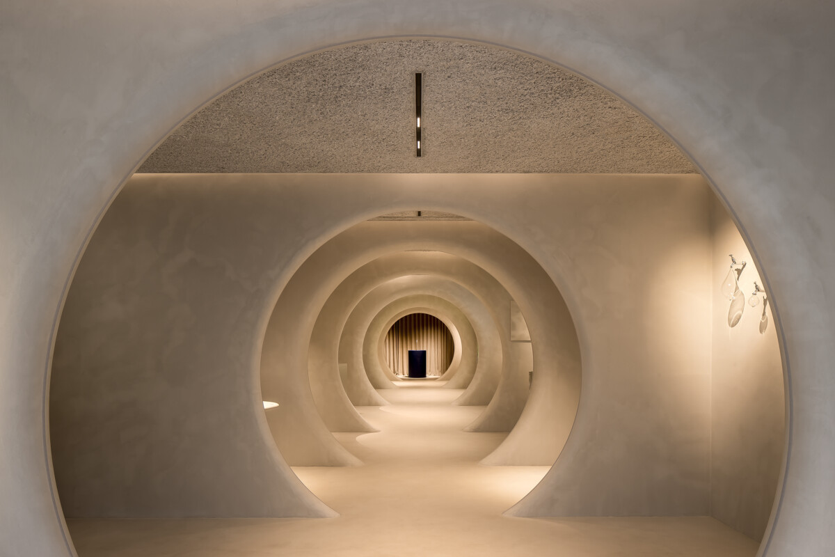
Brand experience
No loose ends. For the product, packaging, and brnad experience alike, we did not compromise on luxury. Every touch point was in line with the strategy.
After the launch of the brand, we developed a well-thought-out digital marketing plan. Hereby, we deployed, in addition to the strategic foundation, the conceptual approach and creative execution needed to support Clarysse. And this not merely for the launch, but as a sustainable long-term partner.
We equipped Clarysse with an in-store display which fits effortlessly into any setting. Its flexible spatial design integrates the branding with high-quality consistency, from colour palette to textures. As a result, their products will always stand out beautifully wherever they are sold.