


The Mocktail Club
— Brand repositioning and packaging design. A Belgian challenger brand that now looks as good as it tastes.


The non-alcoholic drinks market is one of the fastest-growing beverage categories in Europe. Across Belgium and the broader Benelux retail landscape, alcohol-free alternatives have shifted from niche curiosity to mainstream shelf fixture — driven by a growing consumer segment that chooses mindful drinking not as a compromise, but as a deliberate lifestyle statement.
For The Mocktail Club, that market growth was both an opportunity and a competitive threat. More consumer demand meant more challenger brands entering the category, more shelf space contested and less tolerance for packaging that failed to communicate clearly at the point of purchase. In FMCG retail, where purchase decisions are made in under three seconds, on-shelf visibility and instant brand recognition are not nice-to-haves — they are the primary drivers of whether a product gets chosen or passed over.
The category also carried a perception problem that weighed on every brand within it. Alcohol-free drinks were still widely associated with sweetness, compromise and low sophistication — an image that undermined the credibility of any brand trying to occupy a more premium, lifestyle-oriented space. The Mocktail Club had the product quality, the brand conviction and the retail ambition to rise above that perception. What it lacked was a brand identity and packaging design system sharp enough to make that case in the three seconds that matter most.
The brief called for precision, not reinvention. Rather than a full rebrand, the assignment was a focused brand evolution — strategic enough to reposition the brand, and executional enough to deliver immediate impact at retail.
We anchored the repositioning in a core consumer insight: The Mocktail Club is not about replacing alcohol. It is about owning the moment. Crafted drinks for real occasions — dinners with friends, sunny terraces, celebrations that deserve something more considered than a soft drink. That strategic shift moved the brand out of the functional "alcohol-free" category and into a richer emotional territory: mindful celebration, delivered with craft and intention.
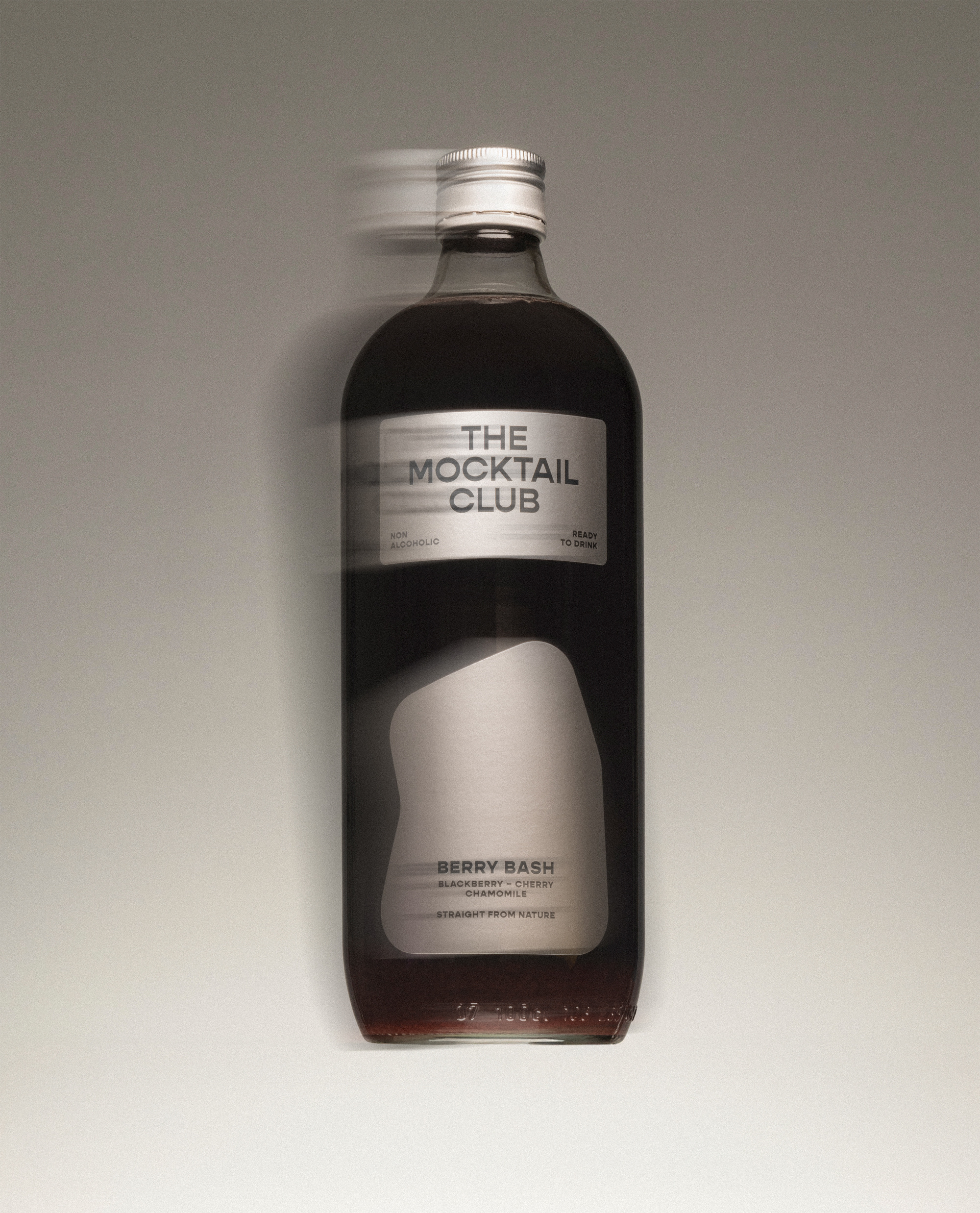
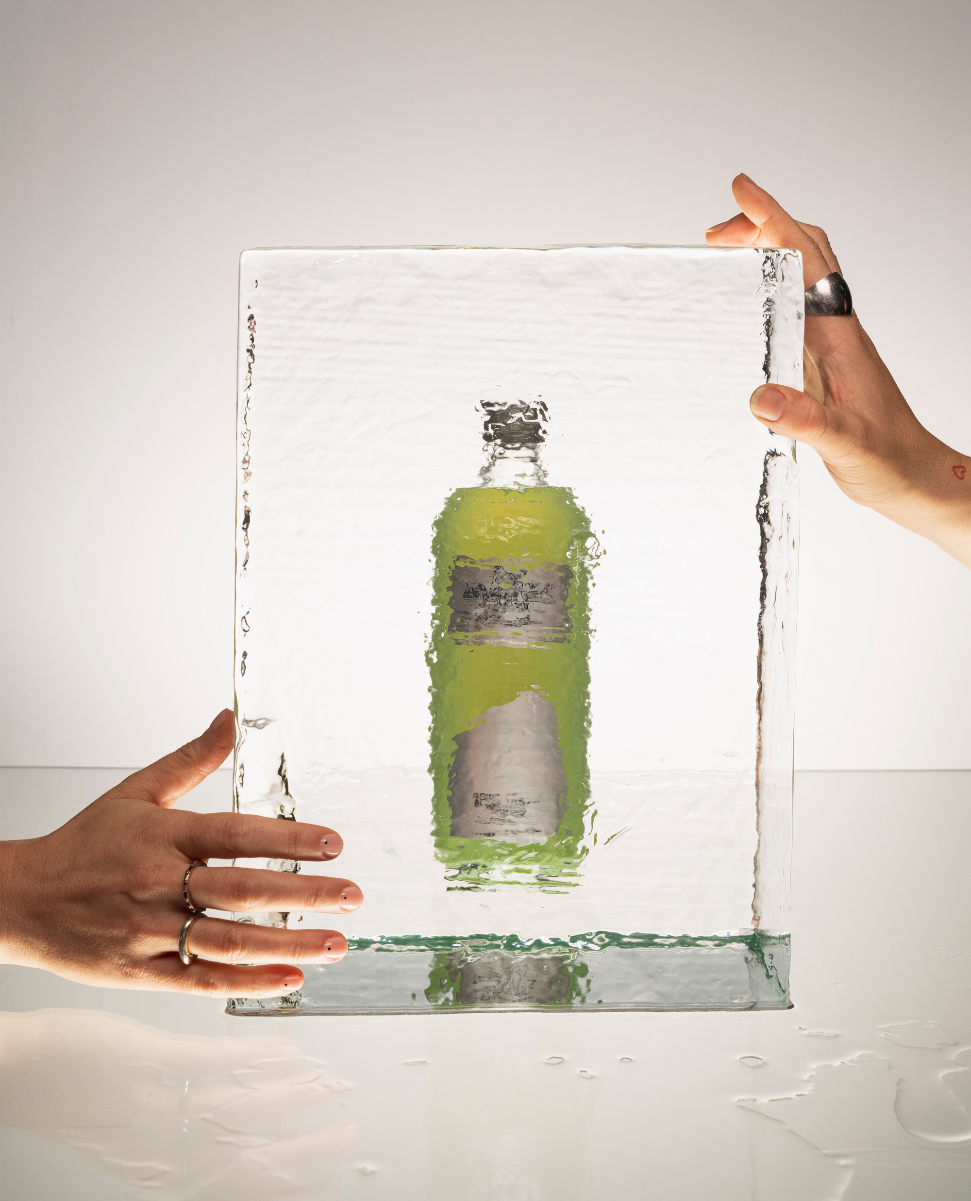
From that positioning foundation, we developed a refined visual identity system built for retail performance and brand coherence across touchpoints. The packaging redesign introduced a bolder graphic language, stronger shelf differentiation and a 3D design approach that gives each bottle the premium presence the product quality demands. The brand narrative was sharpened to match — direct, confident and grounded in the specific occasions The Mocktail Club is built for. The result is a fully integrated beverage branding system: strategy, identity and packaging design working as one coherent argument for why this is the bottle worth choosing.
The Mocktail Club now presents itself with the clarity and confidence its product has always deserved. In a beverage category where brand story and packaging design are the decisive purchase triggers, the gap between product quality and brand perception has been closed.
For any FMCG brand, food and beverage company or challenger brand navigating a competitive retail environment — whether in Belgium, the Benelux or broader European markets — this is what effective beverage branding looks like: a precise strategic repositioning, a packaging design system built for on-shelf impact, and a brand identity strong enough to turn browsers into buyers.


