Belysse
— Global soft flooring expert. Building a new brand woven from heritage and tradition.

Merging history and ambition into an elegant sounding name.


The photographic theme is the people behind the brand. Working together, spontaneously, making things happen. Because they are the heart of Belysse.


Wall-to-wall or carpet tiles. Residential or commercial. Functional, creative, or both. Carpeting comes in many forms. And this new brand has them all covered.
Because it builds on six decades of experience, four sub-brands, and a driving ambition to create sustainable flooring solutions. These were the building blocks with which we created a mature yet modern brand. Confident, elegant, and designed for people. With a serious focus on what is necessary - and the added flair of its sub-brands.
Belysse arose from changes in the textile sector. Its brand architecture is dynamic, allowing for the interplay between an international, main brand and four sub-brands, each with its own features and identity.
Naming
Belysse. A confident-sounding name that looks elegant. Weaving together the history and the ambitions of the brand. 'Lysse' harks back to the river Lys, which is part of the origin of the flax industry. 'Be' radiates self-confidence: We’re here. To stay.
Visual identity
Belysse is mature and reliable. But it is also fresh, modern, and human. The parent brand stands tall. Without overshadowing its sub-brands.
In a corporate sector that tends to be reserved and formal, the warm, relaxed personality of Belysse stands out. The main brand and sub-brands are intertwined but are also given the freedom to do their own thing.
Colours
A fairly neutral colour palette, dominated by an elegant emerald green. A distinct colour palette that represents a conscious choice, as it reflects the brand’s shift from its original low-end demographic to a renewed high-end market positioning. The green hues are also a clear reference to Belysse's sustainable focus.
Typography
The typeface is timeless, modern, and clear - just like Belysse itself.
Imagery identity
A visual world, in which tech and emotion come together. Belysse is a company in which passionate people make innovative, sustainable products, with the end user in mind. And this is exactly what our imagery identity expresses.
The photographic theme is the people behind the brand. Working together, spontaneously, making things happen. Because they are the heart of Belysse.
Brand images
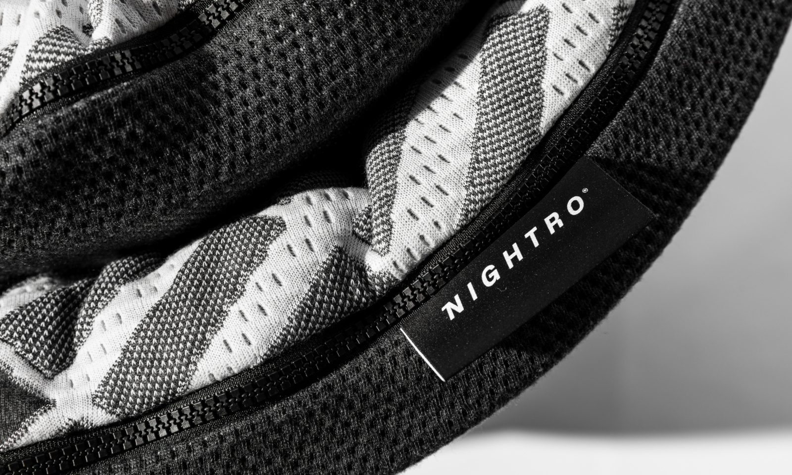
Stylized 3D yarns represent the technological side of the brand. Clean, pure, and constantly in motion, they visually hint at the brand's focus on sustainability.