A Pinch Of
— Redefining ready‑to‑heat meals. How focusing on one standout ingredient led to a fresh name, appetising identity and shelf‑winning packaging.


When it comes to ready-to-heat meals, Culinor is a staple in the Benelux region. As part of the Swiss-listed Orior group, they produce over 40 million freshly prepared meals a year for retailers, supermarkets, schools and hospitals.
One of their brands, Le Patron, was exclusively sold through Delhaize. But when they decided to make most of its stores independent, things got tricky. Suddenly, store owners had the freedom to switch suppliers and Le Patron risked losing its shelf space. The reason? The brand didn’t stand out enough from the competition - both intrinsically and visually. The goal was clear: give Le Patron the competitive edge it was missing and secure its place on the shelves.
To get a better understanding of what might make a retailer swap Le Patron for a rival, we drew on desk research, store visits and interviews with Delhaize teams. It turned out the issues ran deeper than branding alone - shoppers wrestled with foil sticking to their meals and recipes that simply looked flat on the shelf. To tackle these frustrations, we teamed up with Culinor in a product-innovation workshop, which led them to tweak their recipes and even their production lines.
Strategically, we defined taste and creativity as Le Patron’s brand drivers. But the thing with great taste? It’s subjective. So to make it more tangible, we zoomed in on one element of the recipe - a specialty ingredient, an origin story or a unique cooking method - and made it the hero of the meal. That focus didn’t just pave the way for a new brand identity, but also laid the groundwork for a new name.
Naming
With the new strategy in place and recipes refreshed, it became clear that Le Patron needed a clean break, erasing any leftover associations and frustrations from its old identity. The base? A new name that speaks volumes. ‘A Pinch Of’ hints at the brand’s ambition to serve up dishes a tad off the beaten culinary track - a tad more creative, with a little something extra, like an unexpected ingredient or a more adventurous cooking method.
Verbal identity
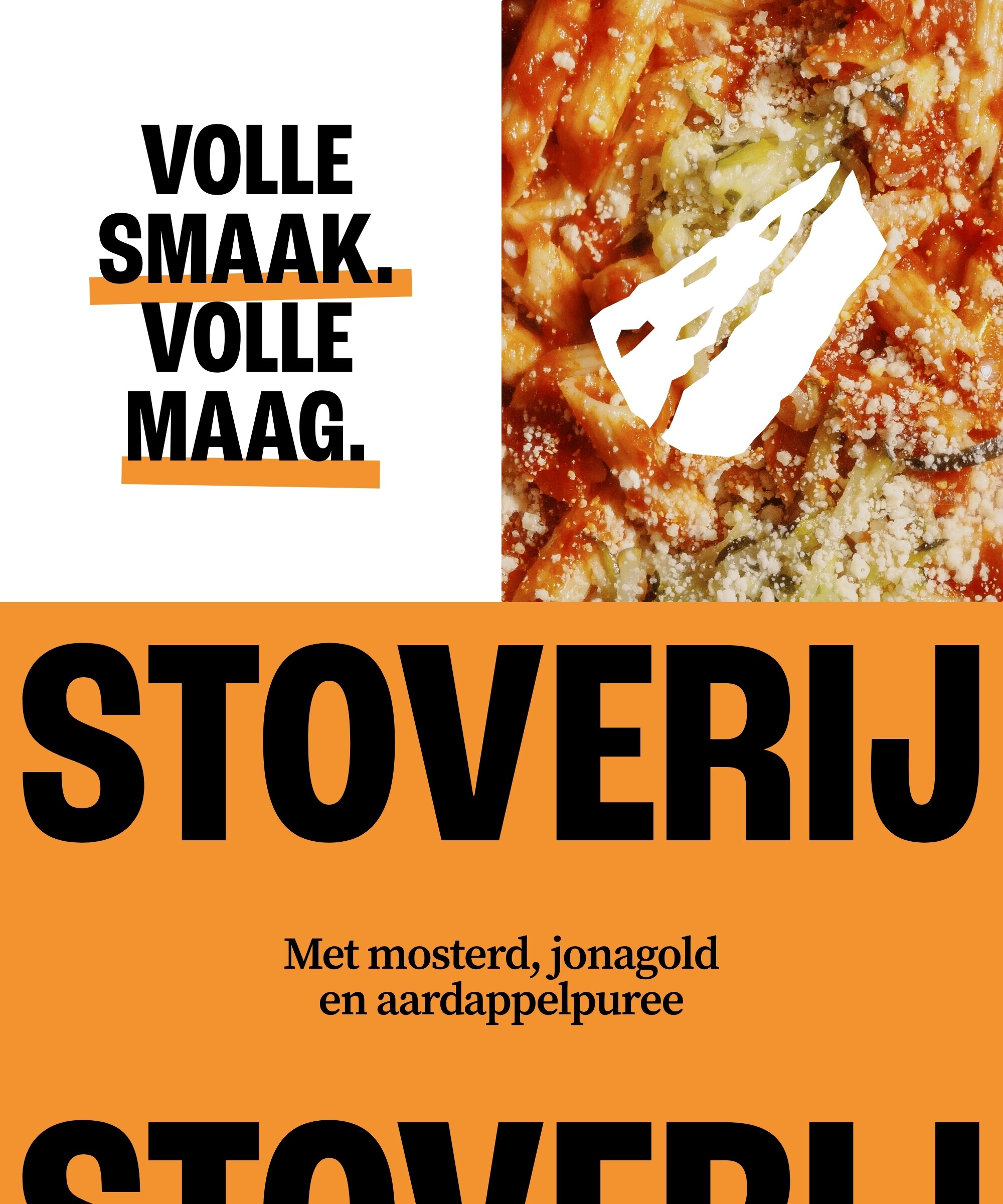
Alongside the new name, we crafted a tone of voice loaded with sensory vocabulary - flavours, textures, aromas and colours - so you can taste, smell and even hear each dish long before your first bite.
Visual identity
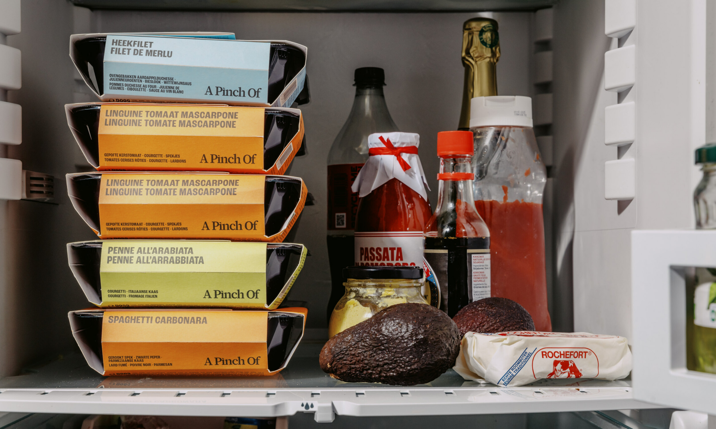
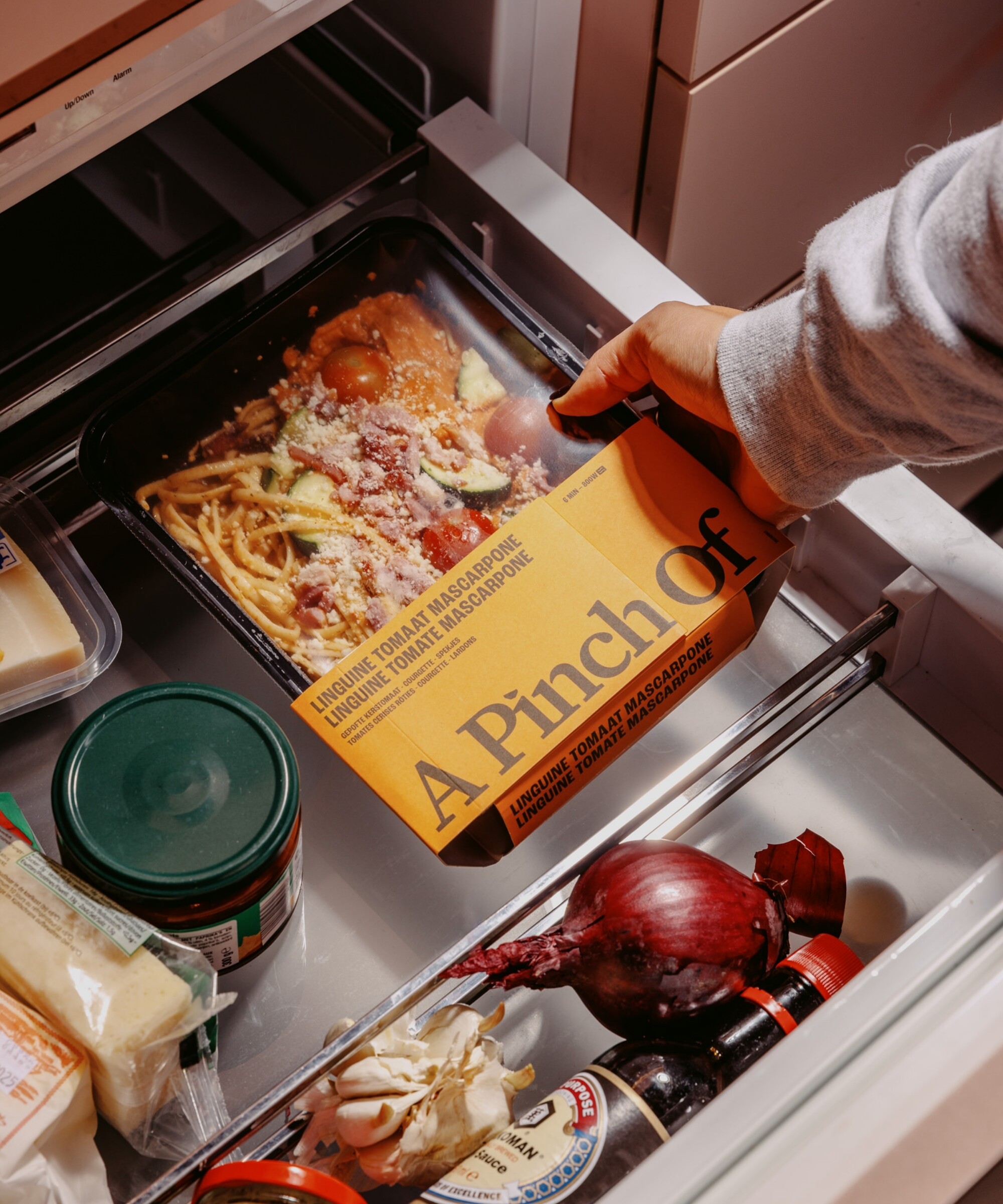
A Pinch Of feels optimistic, imaginative and happy, yet artisanal and comforting at the same time. The handcrafted logo emphasises the brand’s friendly and caring nature, while the colour palette reflects its warm, cheerful and appetising personality. And with a flexible packaging system and modular sleeve, each pack becomes a storytelling tool that lets us highlight the hero ingredient, its origin story or cooking twist.
We kept the imagery cosy and real. You’ll spot meals in warm, home-like settings - sometimes plated, sometimes straight from the tray - with people enjoying them to give it that lived‑in feel. Clean pack shots sit alongside little hand‑drawn illustrations, nodding to the brand’s craftsmanship.


