Belcolade
— The real Belgian chocolate. Converting a classic player into a trusted partner for professionals.


Belcolade, seen as a true classic. But evolved far beyond tradition. The brand had become a blend of innovation, care, and craftsmanship—yet its visual identity hadn’t caught up.
The challenge? Build a brand that reflects Belcolade today: positive, human, and with Belgian roots. One that stands out in a market saturated with browns and golds. One that expresses both flavour and forward thinking, across every touchpoint.
With a clear ambition to lead on sustainability, human connection, and innovation, the brand needed a strategy that would express this new chapter—without losing the credibility built over more than three decades.
We started by sharpening Belcolade’s purpose, distilling it into a brand narrative that balances warmth and boldness, heritage and disruption. This attitude as foundation: from tone of voice and manifesto to visual identity, brand experience and digital behaviour.
Visual identity
The new Belcolade is breezy, artistic, and inventive. A fresh, colourful wind in an industry where golden and dark browns usually set the tone.
A tighter wording of the purpose formed the foundations of the rebranding. You can feel it in every fibre of the brand identity. Including its manifesto, verbal identity and motion identity. And their experience and know-how? That you can taste in the visual identity.
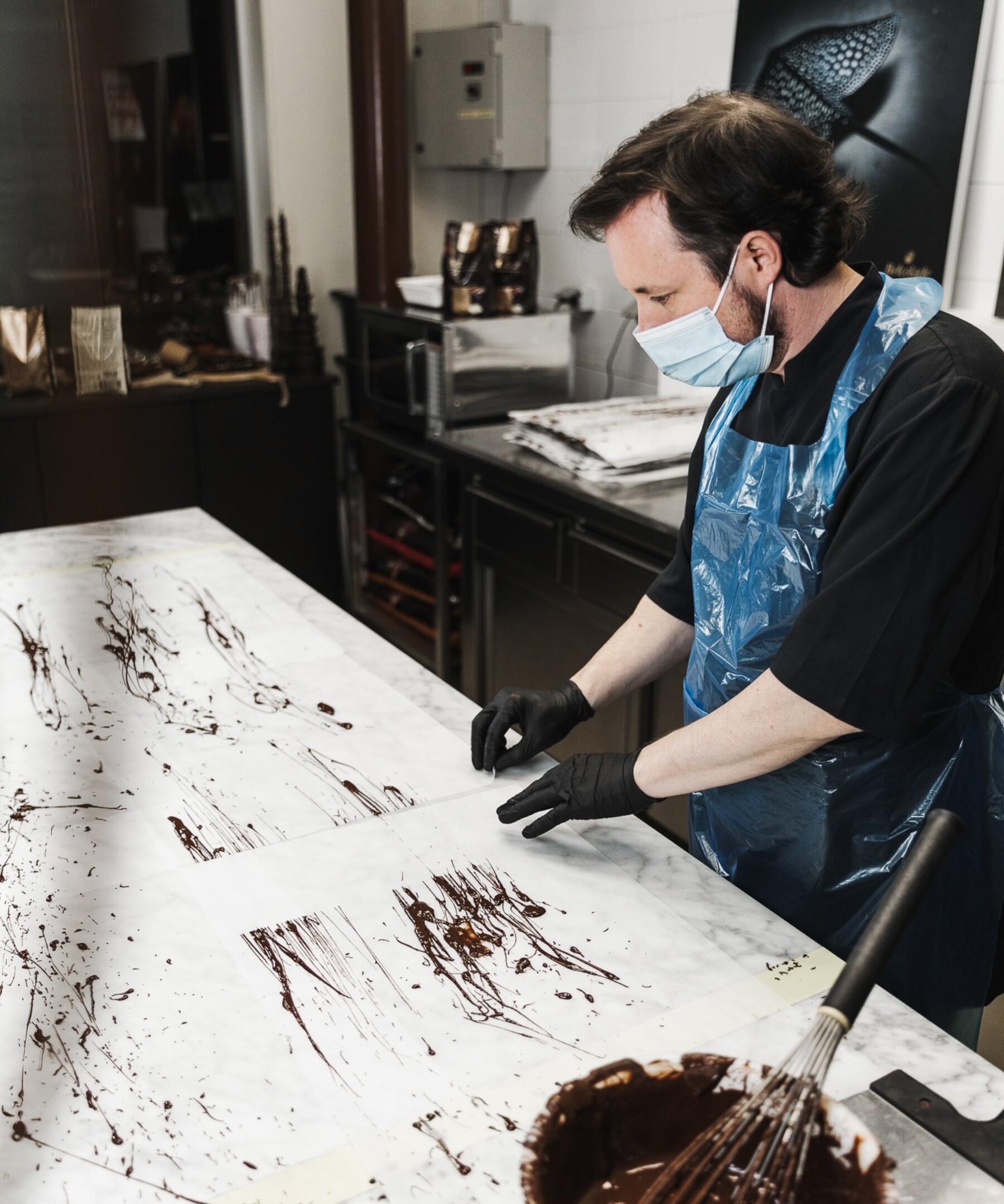
Patterns
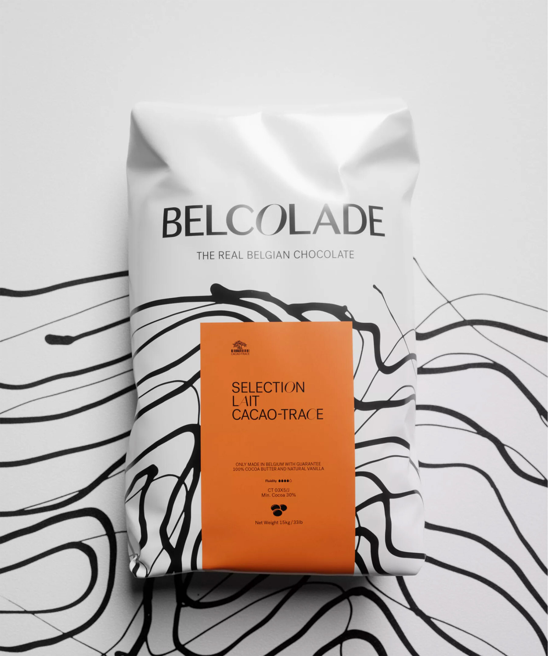
The graphical patterns also pop up in the packaging. Albeit mixed with the signature colour of each chocolate variant. The result? A packaging that really gushes with the thrilling, tasty goodness of chocolate. It jumps out in a sea of brown and golden tints. In this way, the artisanal chocolatier - the target audience of Belcolade - is also given a central role in the identity.
Typography
Neutral and contemporary versus lively and delicate. There is an exciting tension between the two primary fonts. We’ve put them together intentionally to underline the disruptive attitude of Belcolade.
Packaging
The graphical patterns also pop up in the packaging. Albeit mixed with the signature colour of each chocolate variant. The result? A packaging that really gushes with the thrilling, tasty goodness of chocolate. It jumps out in a sea of brown and golden tints.
Brand guidelines
we created a comprehensive brand guide - including presentation and motion templates, digital guidelines, language-friendly fonts, … - and a launch video to roll out the new brand story in various markets in a consistent manner.