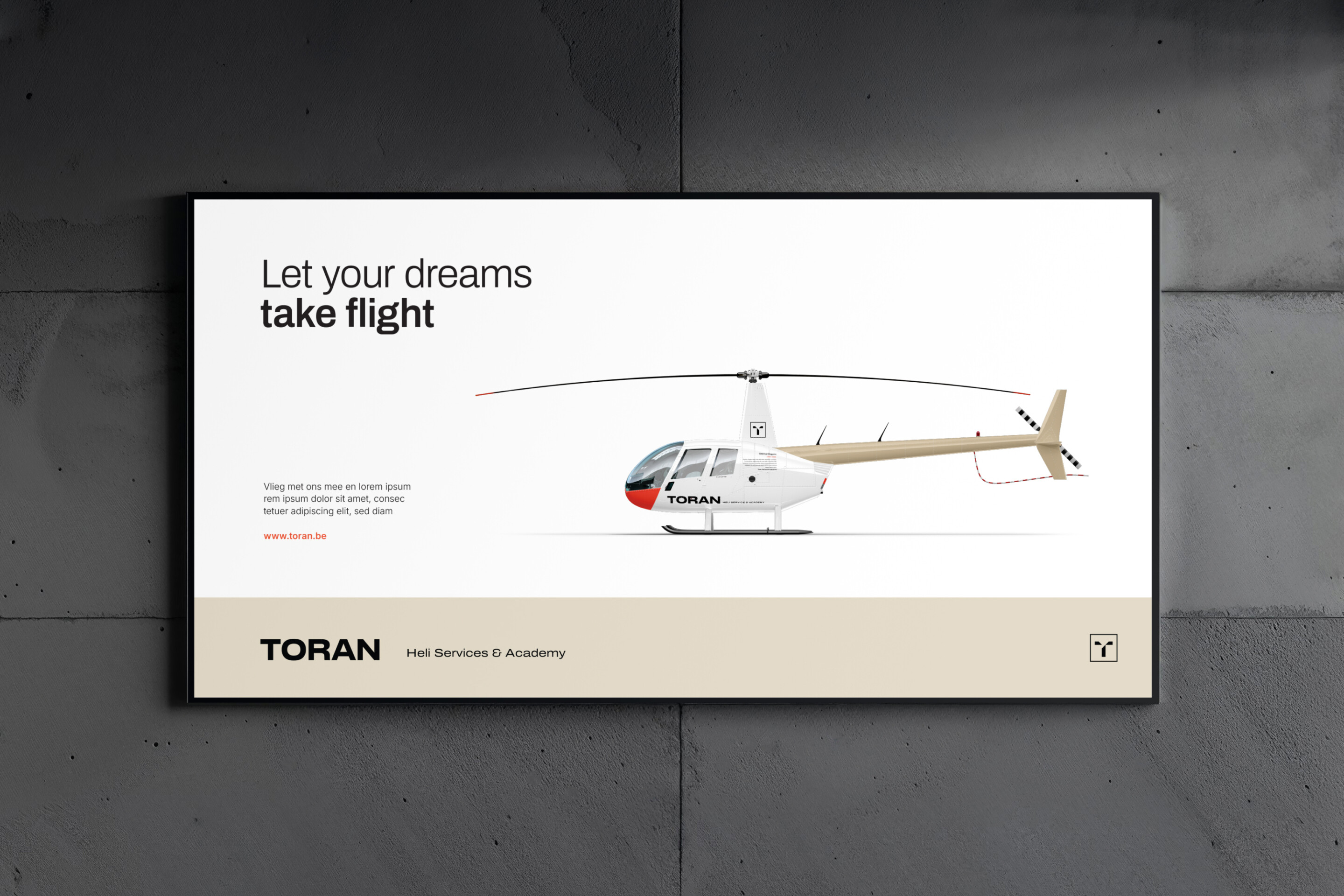
Toran — Let your dreams take flight. Helicopter services & academy.
Wherever you need to go, whatever you need to do—Toran lifts you there.


Toran offered a wide range of helicopter services—from VIP transport and aerial photography to cargo delivery and technical inspections. But while their expertise soared high, their brand didn’t quite reflect the full scope of what they did. The different services lacked cohesion, and their story wasn’t landing clearly with clients.
In addition to these services, Toran also provides certified training for those wishing to become helicopter pilots—a valuable yet often overlooked part of their offering.
The challenge? To bring clarity and unity to all of Toran’s activities, while creating a brand identity that people could connect with—something recognisable, professional, and above all, loveable. Time for a rebrand that would take Toran from a functional service provider to a standout brand with personality and purpose.
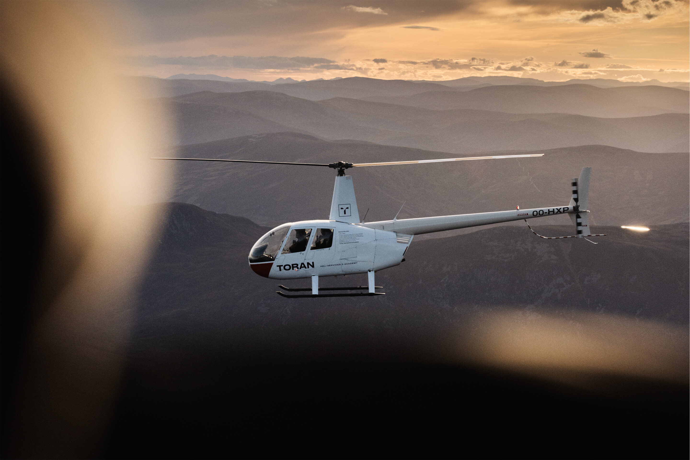
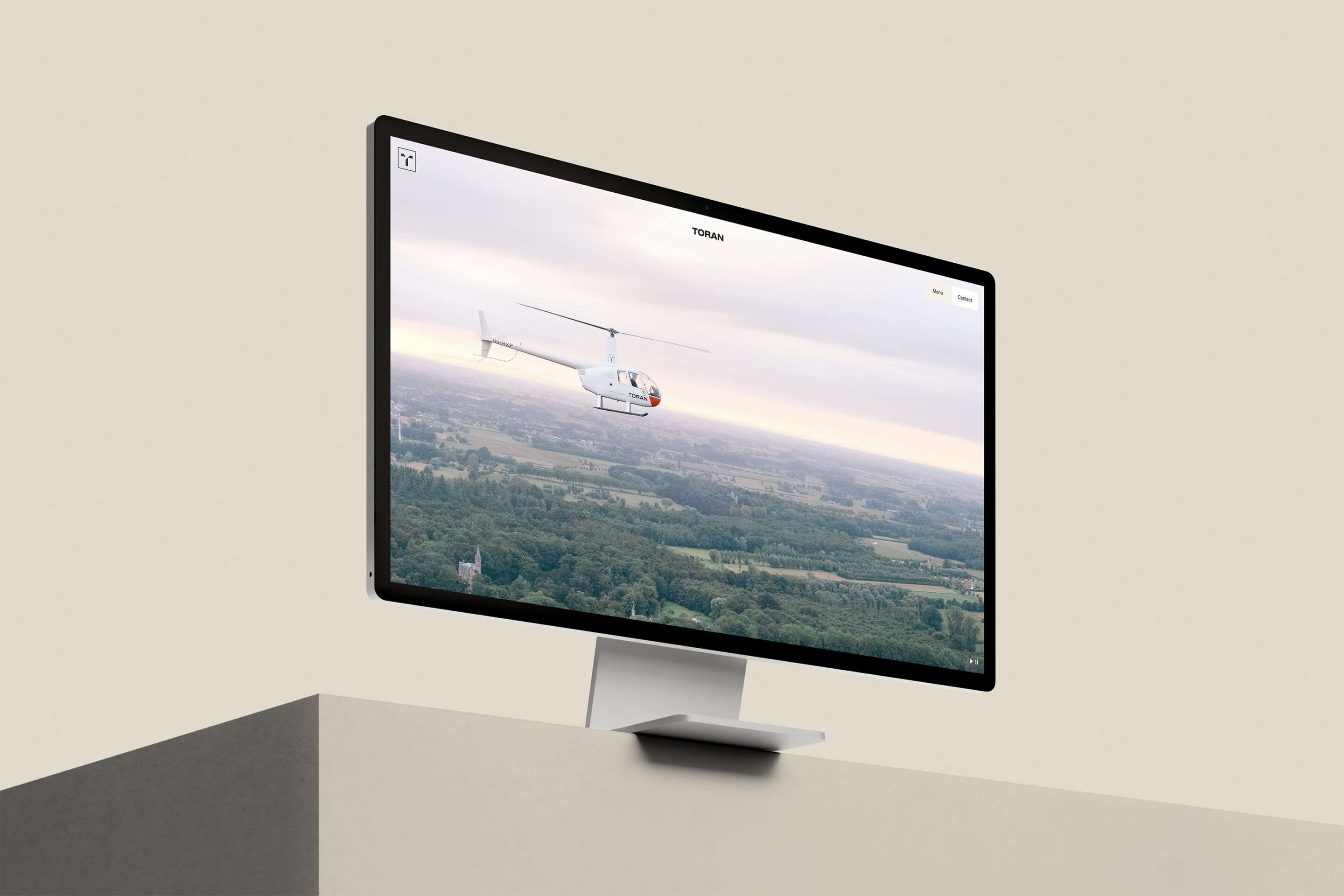
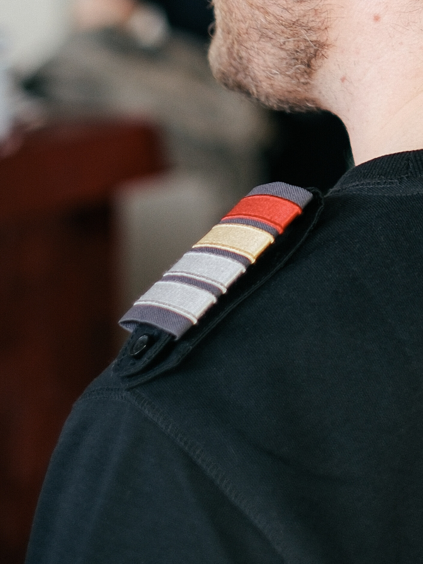
The rebranding concept was built around unity and clarity, with a strong visual identity anchored in the letter T, designed with exacting care. But the real inspiration came from the Arctic tern—nature’s most exceptional long-distance flyer. Known for its epic annual migration from the Arctic to the Antarctic and back again, this bird symbolises endurance, precision, and freedom—qualities that echo Toran’s own values.
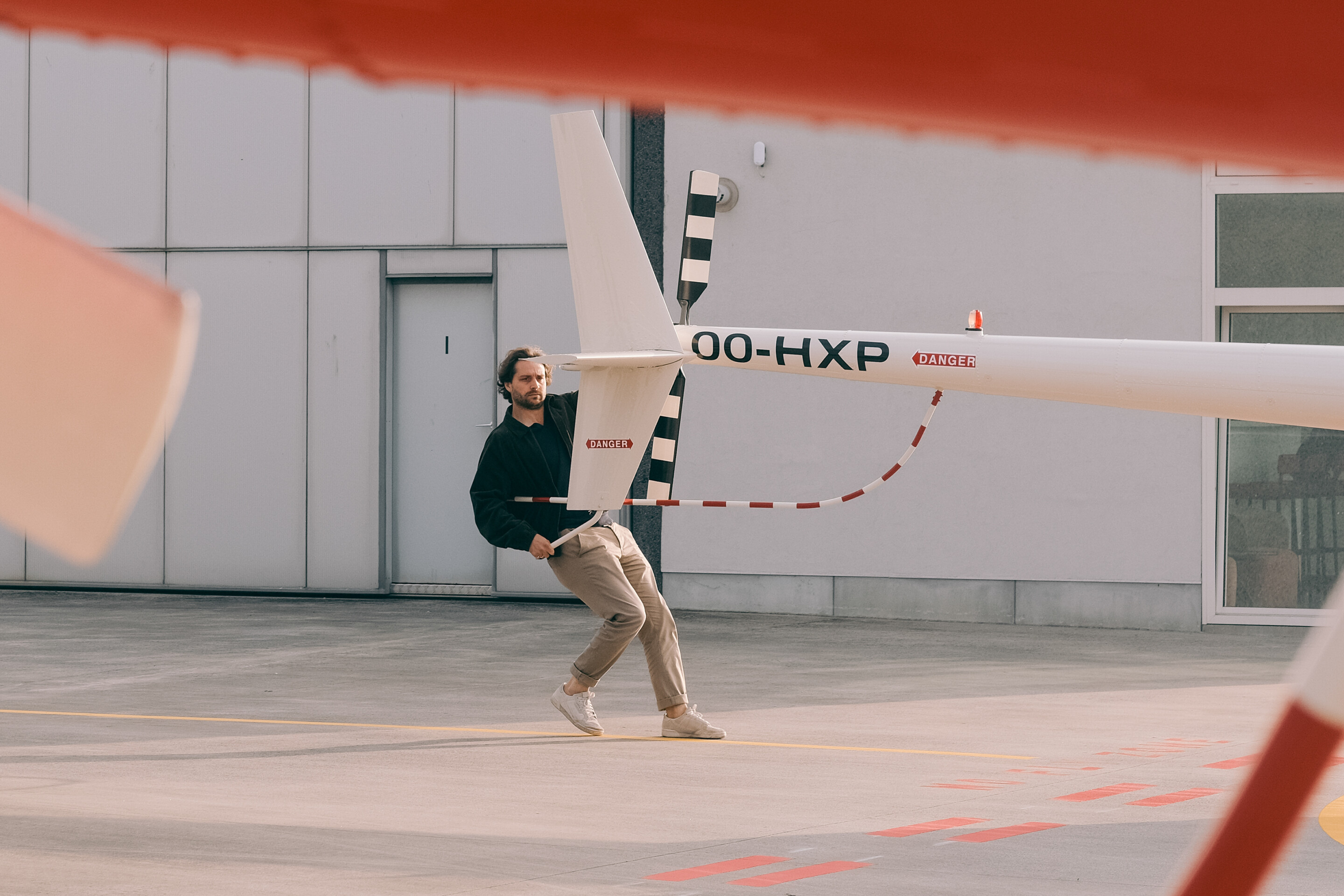
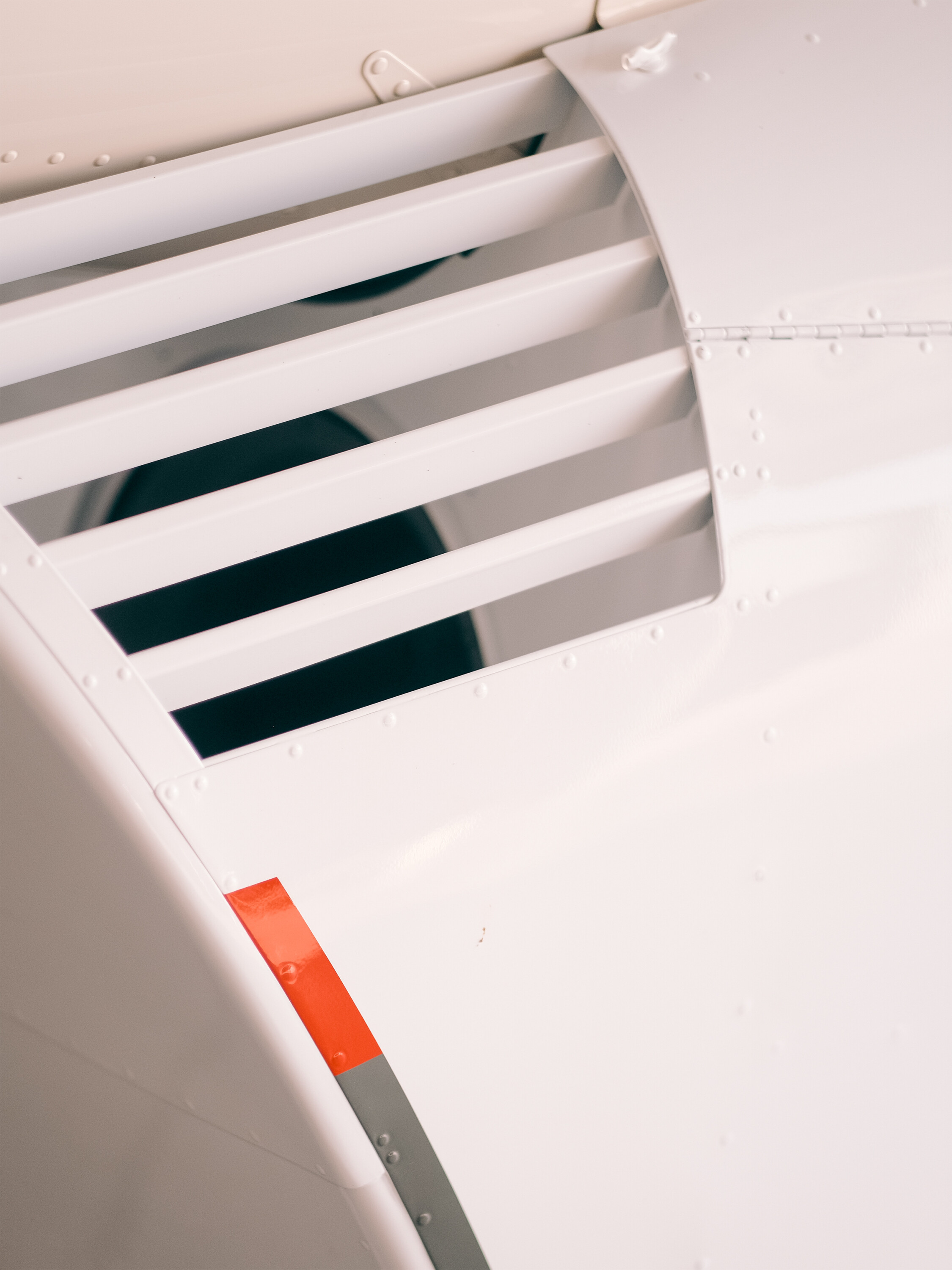
Each helicopter in the fleet became a tribute to this extraordinary species. With a signature design—warm grey tail, white body, and a striking orange-red nose—every aircraft now carries the name and number of a specific tern.
The spatial brand assignment resulted in the newly designed offices and bar, serving as community quarters to unite employees, clients and stakeholders.