Knokke-Heist
— Life at its best. Highlighting the iconic coastal community's contemporary uniqueness.
The brand mark encompasses a range of experiences derived from the 5 districts. And winking at the setting - and then rising - sun.


With a dynamic design language that always starts from the lines of the logo. We let them move and flow into each other. From slow to fast. From tight to curved. From district to district.


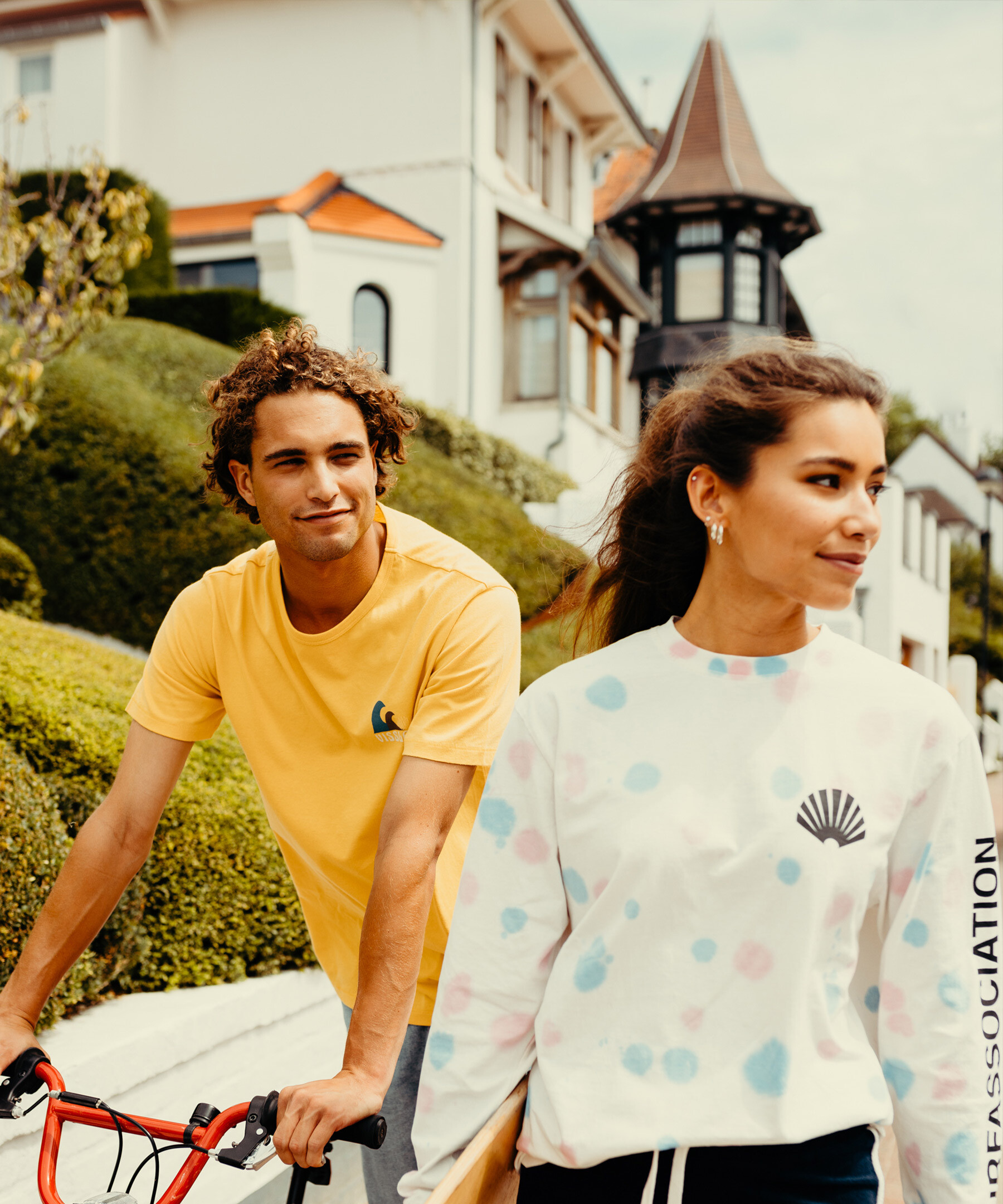
The photography is positive, dynamic, and ‘in the moment’. It is never ‘perfect’ or ‘overly posed’. On the contrary, it is always real and close.


How do you brand a city that’s more than just a destination? While other municipalities promote their attractions, Knokke-Heist wanted to highlight something deeper—its character. The challenge was to capture its emotional richness: the pride in its people, neighbourhoods, and diversity of experiences. All expressed in a way that feels modern, stylish, and unmistakably Knokke-Heist.
Knokke-Heist comprises five districts, each of which has its own special places and experiences. The result? There’s always something to experience - and this applies for visitors and residents alike. Diversity also formed the strategic basis. Not just for the rebranding but also, especially, for the new logo. It encompasses a range of experiences derived from the 5 districts. And winking at the setting - and then rising - sun.
Visual identity
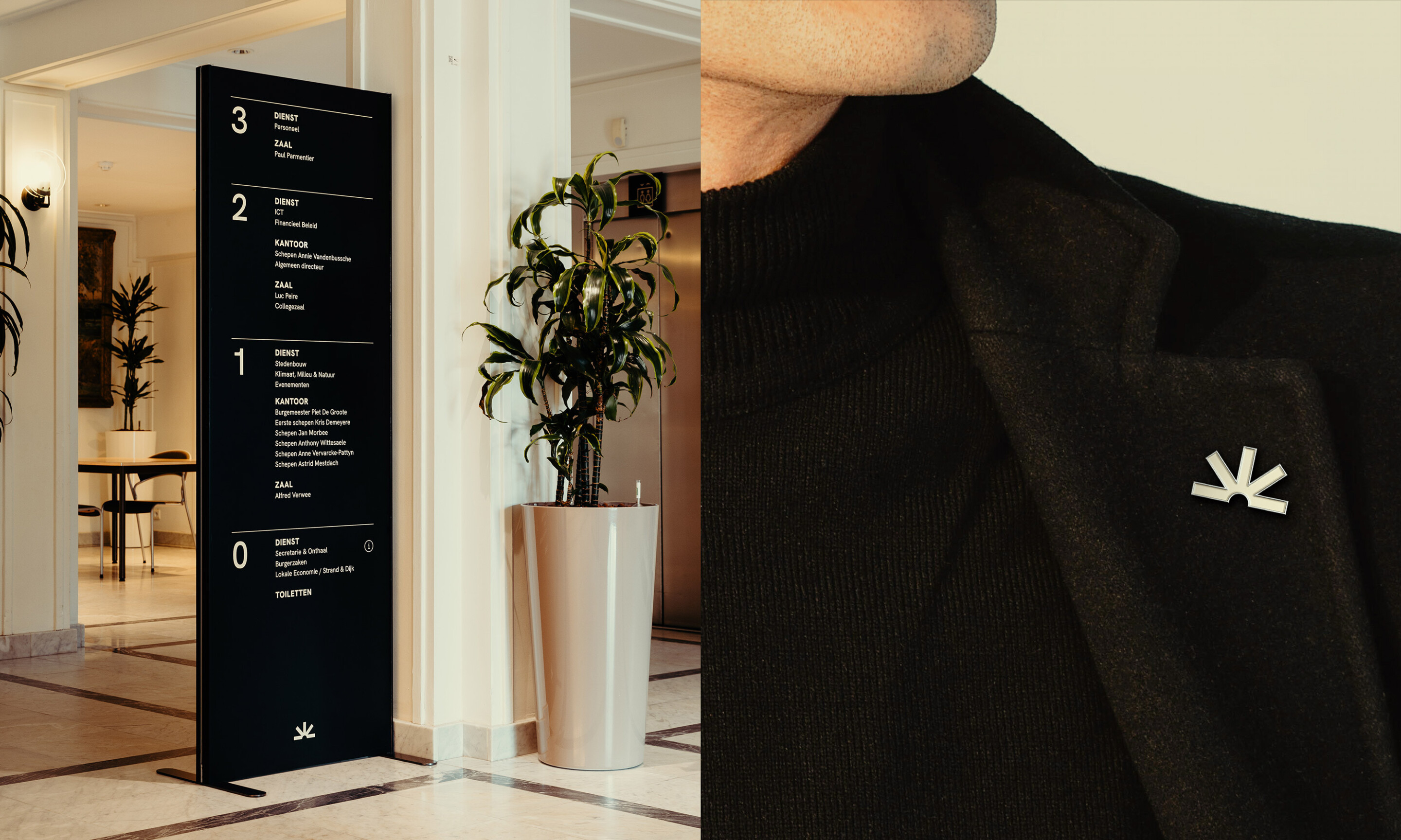
Despite being an ancient icon, Knokke-Heist never stands still. And that called for a dynamic visual language featuring graphic shapes that organically wave, sway, and blow. It needed lines from the logo that move and flow into each other. And a clear, natural, and modern typeface that is immediately recognisable was a must. An identity had to be projected that brings unity yet leaves enough room for flexibility. That way, the various different town departments would all be able to use it.
Colours
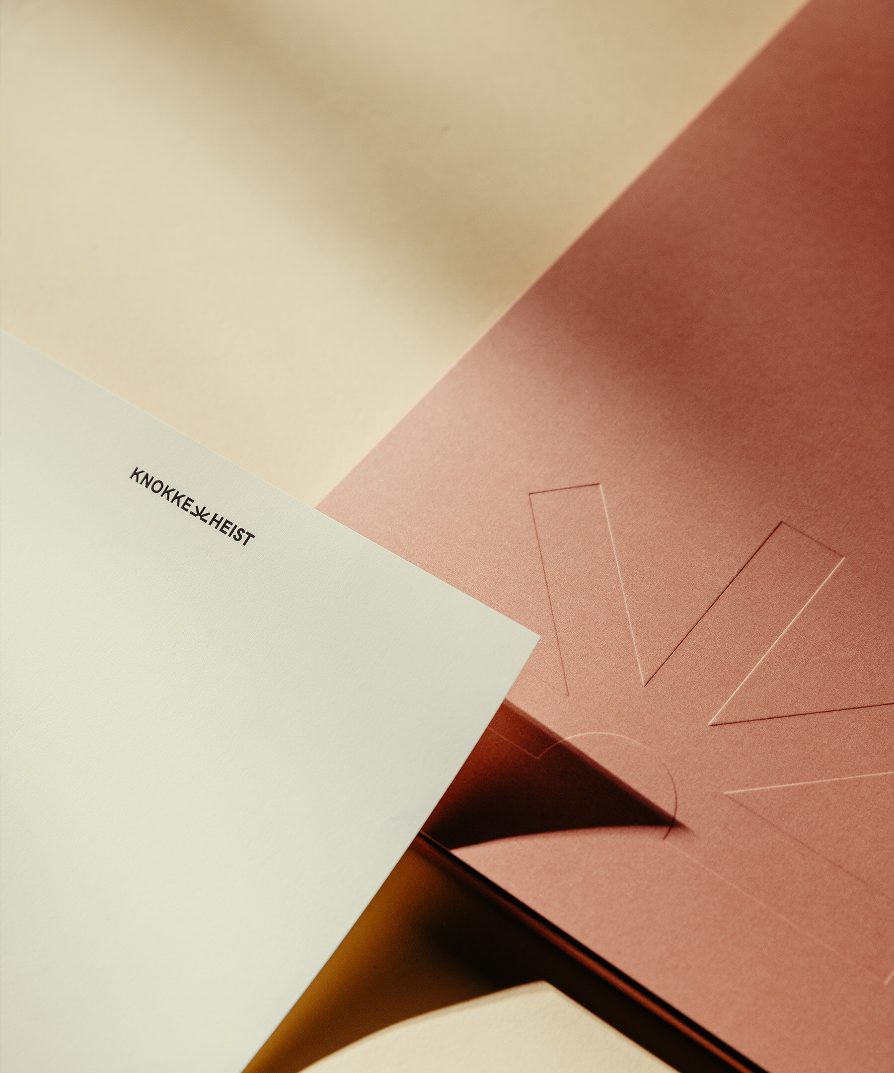
The endless, blue sky. The soft, sand-coloured dunes. The 80s-style pink offered by the Lichttorenplein. The coastal town itself provides the basis for a poetic colour palette that highlights the diversity and colourful character of Knokke-Heist.
Shapes
Knokke-Heist is always on the move. And that also applies to its brand identity. With a dynamic design language that always starts from the lines of the logo. We let them move and flow into each other. From slow to fast. From tight to curved. From district to district. From experience to experience.
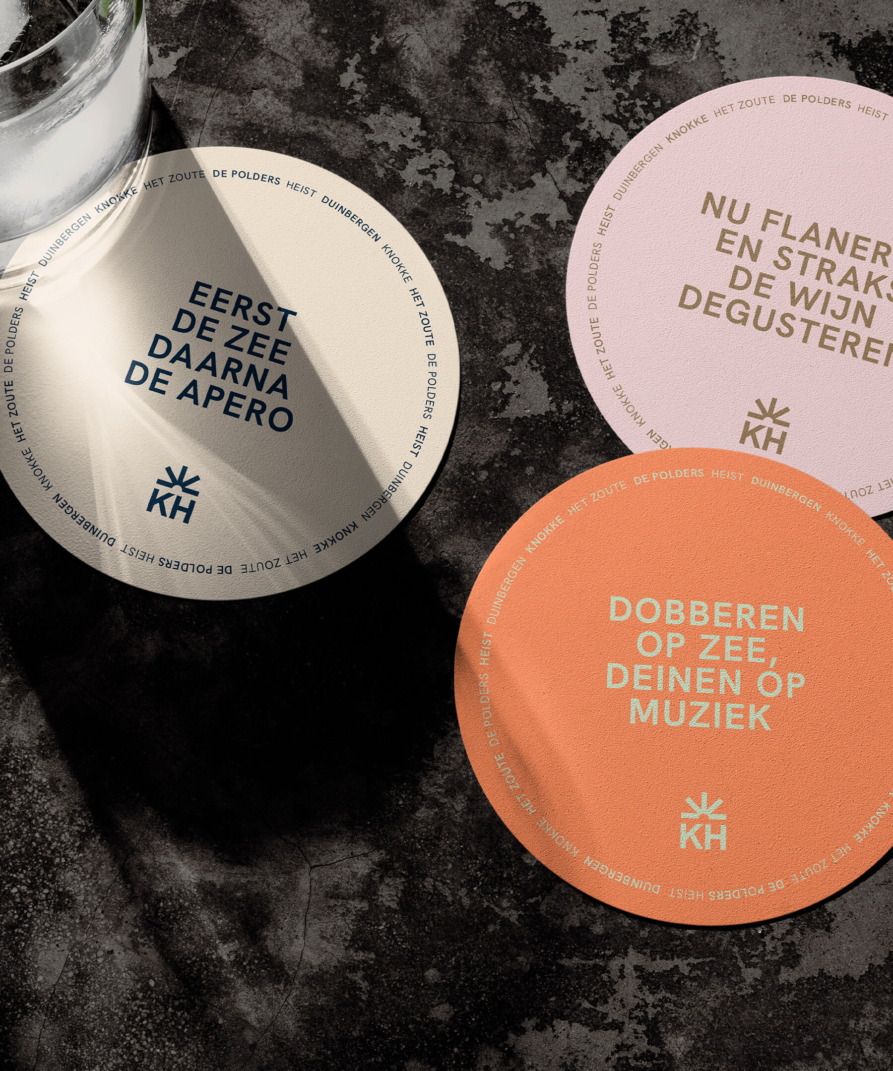
Verbal identity
Waking up in silence, then heading into nature. First some shopping, followed by a visit to a beach bar. Not only the neighbourhoods, but also the experiences flow together seamlessly. This is an aspect that was explicitly highlighted in the verbal identity.
Knokke-Heist is defined by its residents and visitors - not by its attractions. The visual style is positive, dynamic, and ‘in the moment’. It is never ‘perfect’ or ‘overly posed’. On the contrary, it is always real and close. You can continuously feel the presence, even if you aren’t always explicitly seeing it.


